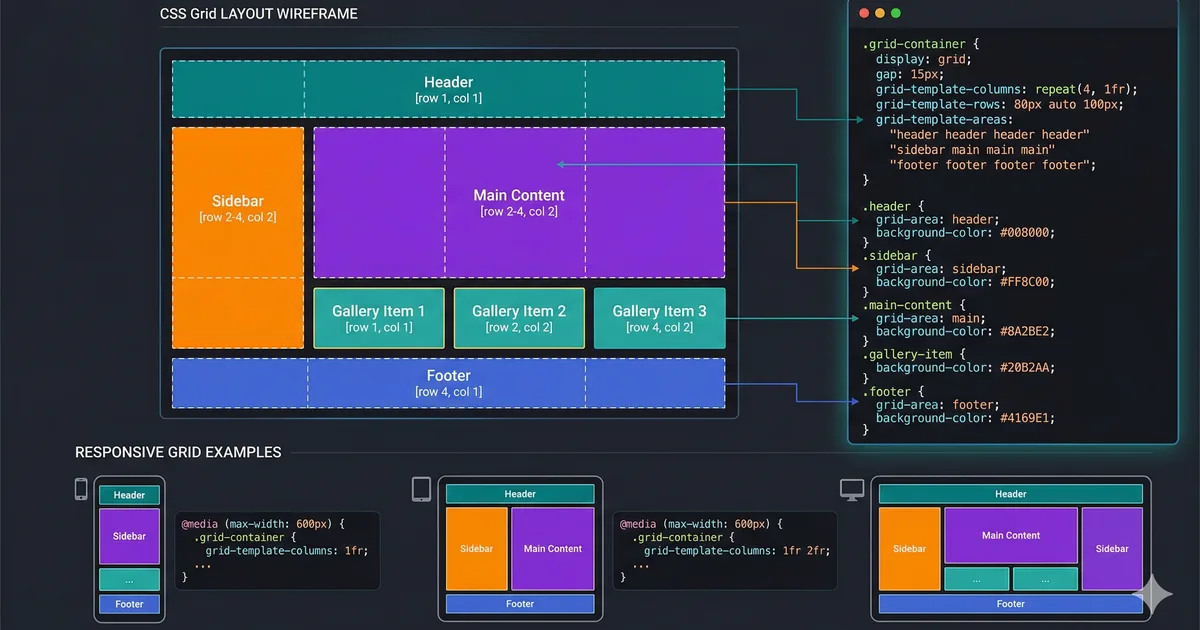
What is CSS Grid?
CSS Grid Layout is a two-dimensional layout system that allows you to create complex layouts with ease. Unlike Flexbox, which works in a single dimension (row or column), Grid works in both dimensions simultaneously.
Basic concepts
To get started with CSS Grid, you only need two things: a container with display: grid and column and row definitions using grid-template-columns and grid-template-rows.
Defining columns
The grid-template-columns property defines the number and size of columns. The fr (fraction) unit is especially useful for distributing available space.
Gap and spacing
The gap property replaces the old grid-gap, grid-row-gap, and grid-column-gap. It defines the space between rows and columns in a simple way.
Advanced techniques
Once you master the basic concepts, you can take advantage of more advanced techniques like named areas, explicit positioning, and the use of minmax() with auto-fill to create truly responsive layouts without media queries.
Named grid areas
Grid areas let you name sections of your layout and place elements using those names, making the code much more readable and easier to maintain.
Responsive without media queries
One of the most powerful features of CSS Grid is the ability to create responsive layouts without media queries, using auto-fill or auto-fit together with minmax().
Conclusion
CSS Grid is an indispensable tool for any modern frontend developer. Combined with Flexbox, it gives you full control over the layout of your applications.
Comments (0)
Sign in to comment