Why dark mode is no longer optional
Dark mode went from being a "nice to have" to a user expectation. Studies show that more than 80% of users enable dark mode when available. Beyond the aesthetic preference, it reduces eye strain in low-light environments and saves battery on OLED screens.
In this guide we will implement a robust theme system using CSS custom properties and Angular signals that supports three modes: light, dark, and system.
The strategy: CSS Custom Properties
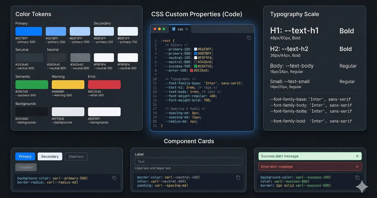
The cleanest approach for dark mode is using CSS custom properties (CSS variables) as design tokens. Instead of writing different styles for each theme, you define your colors as variables and change their values based on the active theme.
Defining the tokens
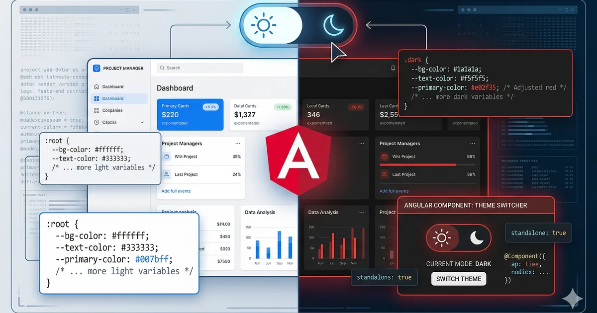
The first step is to define your design tokens in :root for the light theme (default) and in [data-theme="dark"] for the dark theme. See the first code block for the structure.
Why data-theme instead of a class
We use the data-theme attribute on the <html> element instead of a CSS class for several reasons:
- Semantic separation: data attributes are for data, classes are for styles
- Avoids collisions with Tailwind or Bootstrap utility classes
- It is easier to select with
[data-theme="dark"]than with.dark - Supports more than two values (you could have
data-theme="sepia"in the future)
Using tokens in your components
Once the tokens are defined, using them in any component is natural:
.card {
  background: var(--color-bg-elevated);
  color: var(--color-text-primary);
  border: 1px solid var(--color-border);
  box-shadow: var(--shadow-sm);
  border-radius: 12px;
  padding: 1.5rem;
}

.card-subtitle {
  color: var(--color-text-secondary);
}
You do not need any @if or media query. Colors update automatically when the data-theme attribute changes.
The ThemeService in Angular
The theme service is the brain of the system. It uses Angular signals for reactive and clean state management. See the second code block for the complete implementation.
Key points of the service
Three modes, not two: In addition to "light" and "dark", we support "system" which respects the operating system preference. This is the correct approach in terms of UX.
Persistence: We save the preference in localStorage so it survives between sessions.
Reactive system changes: We listen for changes in the system's prefers-color-scheme to update in real time if the user has selected "system" mode.
Effect to synchronize: We use effect() so that every time the theme signal changes, the DOM is updated and the preference is persisted automatically.
The toggle component
The toggle component is simple but accessible. See the third code block. Important aspects:
- Dynamic aria-label: Informs the screen reader what the current theme is
- Icons with aria-hidden: SVGs are decorative, not informational
- Three states: The button cycles between light, dark, and system
- Type button: Prevents accidental submit if inside a form
Smooth transitions between themes
To prevent the theme change from being abrupt, add transitions to the properties that use your tokens:
:root {
  --transition-theme: background-color 200ms ease, color 200ms ease,
    border-color 200ms ease, box-shadow 200ms ease;
}

body {
  transition: var(--transition-theme);
}

.card,
.navbar,
.sidebar,
.footer {
  transition: var(--transition-theme);
}
Be careful with transition: all
Do not use transition: all for theme switching. It is tempting, but causes problems:
- Animates properties you should not (like
width,height) - Impacts performance (the browser has to check all properties)
- Can cause strange flickering in elements with their own animations
Be explicit about the properties you want to animate.
Preventing the flash of unstyled theme
If the theme is applied via JavaScript, there is a brief moment where the default theme (light) shows before the script executes. This is called FOUT (Flash of Unstyled Theme) and is annoying for users with dark mode.
Solution: blocking script in the head
Add an inline script in the <head> of your index.html:
<script>
  (function() {
    const theme = localStorage.getItem('preferred-theme');
    const resolved = theme === 'dark' ? 'dark'
      : theme === 'light' ? 'light'
      : window.matchMedia('(prefers-color-scheme: dark)').matches
        ? 'dark' : 'light';
    document.documentElement.setAttribute('data-theme', resolved);
  })();
</script>
This script runs before the page is painted, eliminating the flash. It is small and intentionally blocking.
Theme-adaptive images
Some assets need different versions for each theme (logos, illustrations):
<picture>
  <source
    srcset="/images/logo-dark.svg"
    media="(prefers-color-scheme: dark)" />
  <img
    src="/images/logo-light.svg"
    alt="Logo" />
</picture>
For images controlled by your data-theme attribute, use CSS:
.logo-img {
  content: url('/images/logo-light.svg');
}

[data-theme="dark"] .logo-img {
  content: url('/images/logo-dark.svg');
}
Accessibility in dark mode
Dark mode has specific accessibility challenges:
Contrast
- Do not use pure white (#ffffff) on pure black (#000000). It is too much contrast and causes fatigue
- Use soft white (#f0f0f5) on very dark gray (#0a0a0f)
- Verify the contrast of both themes with tools like WebAIM's contrast checker
Accent colors
Your accent color may need adjustments between themes. An orange that looks good on a white background may not have enough contrast on a dark background. Adjust the luminosity in your dark tokens.
Focus indicators
Focus indicators must be visible in both themes. A blue outline works in light mode but can get lost in dark mode. Define focus styles per theme:
:root {
  --color-focus: #0066ff;
}

[data-theme="dark"] {
  --color-focus: #66aaff;
}

:focus-visible {
  outline: 2px solid var(--color-focus);
  outline-offset: 2px;
}
Testing dark mode
Verify your implementation with this checklist:
- The theme persists on page reload
- There is no flash of the wrong theme on load
- "System" mode responds to OS changes in real time
- All text passes WCAG AA contrast in both themes
- Focus indicators are visible in both themes
- Images and logos display correctly in both themes
- Transitions are smooth and do not cause flickering
Conclusion
A well-implemented dark mode improves user experience, demonstrates attention to detail, and is expected in any modern web application. With CSS custom properties as the foundation and Angular signals for state management, you have a robust, maintainable, and accessible system.
The key is to treat it as a design token system, not a color inversion hack. This prepares you to expand to more themes in the future if needed.
Comments (0)
Sign in to comment