Why you need a design system
If you work on a growing project, sooner or later you'll face these problems:
- 47 different shades of gray in your CSS
- Buttons that look different on every page
- A component that takes 2 hours to create because there are no established patterns
- Inconsistencies between what the UX team designs and what the development team implements
A design system solves all of this by establishing rules, tokens, and reusable components. And you don't need to be a large company to have one.
The three-level architecture
A well-structured design system has three levels of tokens, each with a specific purpose.
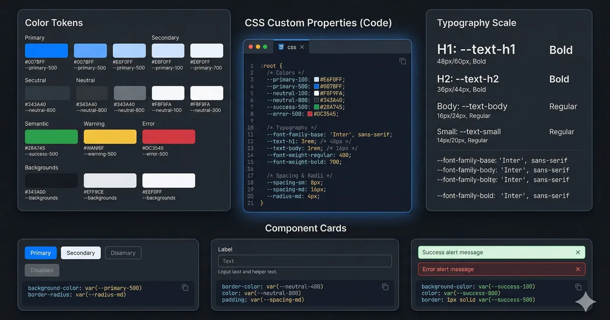
Level 1: Primitive tokens
These are the raw values: hex colors, sizes in rem, font names. They have no semantic meaning. --primitive-ember-500 is an orange, nothing more.
These tokens are never used directly in components. They are the foundation upon which everything else is built.
Level 2: Semantic tokens
They assign meaning to primitives. --surface-primary doesn't say "light gray," it says "the main background of the application." This allows the same token to have different values depending on the theme.
Semantic tokens are the ones you use most in your components. When you write background: var(--surface-elevated), it doesn't matter if the theme is light or dark; the correct value resolves automatically.
Level 3: Component tokens
These are local CSS variables that define the visual API of a component. The .btn component defines --btn-height, --btn-bg, etc., and its variants only override those tokens without duplicating styles.
Implementing the spacing scale
Consistent spacing is what separates an amateur design from a professional one. Use a scale based on multiples:
:root {
  --space-1: 0.25rem;  /* 4px */
  --space-2: 0.5rem;   /* 8px */
  --space-3: 0.75rem;  /* 12px */
  --space-4: 1rem;     /* 16px */
  --space-6: 1.5rem;   /* 24px */
  --space-8: 2rem;     /* 32px */
  --space-12: 3rem;    /* 48px */
  --space-16: 4rem;    /* 64px */
  --space-24: 6rem;    /* 96px */
}
The rule: never use magic values. If you need margin-top: 1.25rem, ask yourself why it doesn't fit in the scale. Usually the answer is that the design has an inconsistency.
Typographic system
Size scale
Define a typographic scale with purpose:
:root {
  --text-xs: 0.75rem;    /* Labels, captions */
  --text-sm: 0.875rem;   /* Body small, metadata */
  --text-base: 1rem;     /* Body text */
  --text-lg: 1.125rem;   /* Body large */
  --text-xl: 1.25rem;    /* H4 */
  --text-2xl: 1.5rem;    /* H3 */
  --text-3xl: 1.875rem;  /* H2 */
  --text-4xl: 2.25rem;   /* H1 */
  --text-5xl: 3rem;      /* Display */
}
Line height by context
Don't use a global line-height. Different sizes need different ratios:
:root {
  --leading-tight: 1.2;   /* Headings */
  --leading-normal: 1.5;  /* Body text */
  --leading-relaxed: 1.75; /* Long text (blog) */
}
Components with local tokens
The most powerful technique in the design system is using local tokens in components. Instead of creating variants by duplicating styles, you define the component's "API" as custom properties and variants only override those values.
Look at the third code block to see how it works with a .btn component. The .btn--secondary and .btn--lg variants don't repeat any base styles; they only change the tokens they need.
Advantages of this pattern
- Zero duplication: The base style is written only once
- Trivial variants: Creating a new variant is overriding 2-3 tokens
- Themeable: Component tokens can reference semantic tokens
- Easy debugging: You inspect an element and see exactly which tokens it uses
Cards as a case study
Cards are the most common component in web applications. Here's how to implement them with the token system:
.card {
  --card-padding: var(--space-6);
  --card-radius: var(--primitive-radius-lg);
  --card-bg: var(--surface-elevated);
  --card-border: var(--border-default);

  background: var(--card-bg);
  border: 1px solid var(--card-border);
  border-radius: var(--card-radius);
  padding: var(--card-padding);
  transition: border-color 150ms ease;
}

.card:hover {
  --card-border: var(--border-strong);
}

.card--compact {
  --card-padding: var(--space-4);
}

.card--glass {
  --card-bg: rgb(255 255 255 / 6%);
  backdrop-filter: blur(16px);
}
Responsive tokens
For responsive design, you can change global tokens in media queries:
:root {
  --content-width: 90rem;
  --content-padding: var(--space-4);
  --section-gap: var(--space-8);
}

@media (min-width: 768px) {
  :root {
    --content-padding: var(--space-8);
    --section-gap: var(--space-16);
  }
}

@media (min-width: 1280px) {
  :root {
    --content-padding: var(--space-12);
    --section-gap: var(--space-24);
  }
}
All components that use these tokens adapt automatically without their own media queries.
Design system documentation
A design system without documentation is just a CSS repository. Document at least:
Token inventory
Create a page that shows all your tokens with their values and uses:
| Token | Light | Dark | Use |
|---|---|---|---|
--surface-primary |
#fafafa | #0a0a0f | Main background |
--surface-elevated |
#ffffff | #1a1a28 | Cards, modals |
--text-primary |
#1a1a2e | #f0f0f5 | Main text |
--interactive-primary |
#ff530f | #ff6b35 | CTA buttons |
Component catalog
For each component document:
- Available variants
- Accepted tokens
- Usage examples
- Accessibility considerations
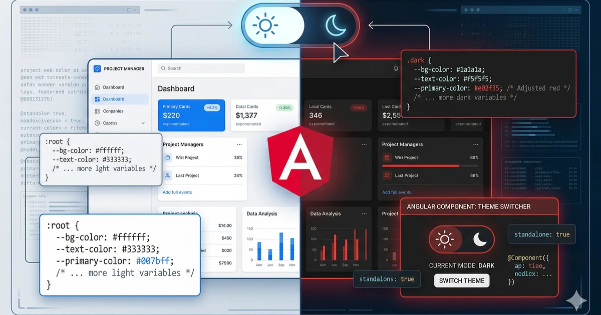
Integration with Angular
In Angular, you can encapsulate your tokens in the global styles.css and use them in components with ViewEncapsulation.None for global tokens, or directly in component styles for local tokens:
@Component({
  selector: 'app-card',
  changeDetection: ChangeDetectionStrategy.OnPush,
  template: `
    <div class="card" [class.card--compact]="compact()">
      <ng-content />
    </div>
  `,
  styleUrl: './card.css',
})
export class CardComponent {
  compact = input(false);
}
Common mistakes
Too many tokens
If you have --color-blue-100 through --color-blue-900 for 15 colors, you have too many. Use only the ones you actually need. A good design system has 30-50 semantic tokens, not 300.
Unused tokens
Review periodically and remove unused tokens. A dead token is noise in the codebase.
Skipping the semantic layer
Using var(--primitive-gray-700) directly in a component breaks themability. Always go through a semantic token.
Not documenting
If another developer can't understand your system in 10 minutes, you need better documentation.
Conclusion
A design system based on CSS custom properties is powerful, maintainable, and requires no external dependencies. The three-level architecture (primitive, semantic, component) gives you the flexibility to change themes, create variants, and scale without accumulating technical debt.
Start small: define your colors, spacing, and typography as tokens. Then build components that consume them. In a few weeks you'll have a system that accelerates your development and maintains the visual consistency of your product.
Comments (0)
Sign in to comment