Why web accessibility matters
Web accessibility (a11y) is not an extra or a "nice to have." It is a fundamental requirement that benefits all your users:
- 1 in 5 people has some form of disability
- Users with temporary disabilities (broken arm, eye infection)
- Users in situational contexts (sun on the screen, hands occupied)
- Older users with reduced vision or mobility
- Improves SEO and overall usability
Additionally, in many countries web accessibility is a legal requirement. The European Accessibility Act takes effect in June 2025, and the ADA in the United States has already generated thousands of lawsuits over inaccessible websites.
WCAG 2.2: the four principles
The Web Content Accessibility Guidelines are organized around four fundamental principles, known as POUR:
1. Perceivable
Content must be perceivable through all available senses.
2. Operable
The interface must be operable by any user with any input device.
3. Understandable
The content and interface must be understandable.
4. Robust
Content must be interpretable by current and future assistive technologies.
Complete checklist by category
Structure and semantics
- Use a single
<main>per page - Headings in hierarchical order without gaps (
h1->h2->h3) - Correct landmarks:
<header>,<nav>,<main>,<aside>,<footer> - Semantic lists for groups of items (
<ul>,<ol>,<dl>) - Tables with
<caption>,<thead>,<th scope="col|row"> - Document language declared:
<html lang="es"> - Language changes marked:
<span lang="en">Responsive design</span>
Images and multimedia
- All informative images have a descriptive
alt - Decorative images use
alt=""oraria-hidden="true" - Complex graphics have a long description with
aria-describedby - Videos have subtitles
- Audio has a transcript available
- Animations can be paused or disabled
- Respect
prefers-reduced-motion:
@media (prefers-reduced-motion: reduce) {
*,
*::before,
*::after {
animation-duration: 0.01ms !important;
animation-iteration-count: 1 !important;
transition-duration: 0.01ms !important;
scroll-behavior: auto !important;
}
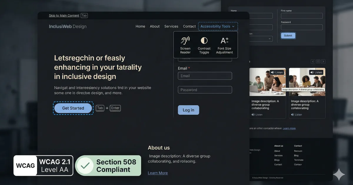
}Keyboard navigation
- All interactive elements are reachable with Tab
- Tab order is logical and predictable
- Focus is visible at all times (
:focus-visible) - There are no keyboard traps (user can exit with Tab/Escape)
- A "Skip to content" link exists
- Modals trap focus correctly (focus trapping)
- Escape closes modals and popups
- Keyboard shortcuts do not interfere with the browser
Forms
- Each input has a
<label>associated withfor/id - Input groups use
<fieldset>and<legend> - Required fields have
aria-required="true"orrequired - Errors are announced with
aria-describedbyandaria-invalid - Autocomplete uses
autocompletewith correct values - Format instructions are visible, not only as placeholder
<div class="form-group">
  <label for="email">Correo electronico</label>
  <input
    id="email"
    type="email"
    required
    autocomplete="email"
    aria-describedby="email-help email-error"
  />
  <p id="email-help" class="hint">Ejemplo: [email protected]</p>
  <p id="email-error" class="error" role="alert" aria-live="assertive">
    <!-- Mensaje de error dinámico -->
  </p>
</div>
Color and contrast
- Minimum contrast ratio 4.5:1 for normal text (AA)
- Minimum contrast ratio 3:1 for large text (24px+ or 19px+ bold)
- Minimum contrast ratio 3:1 for UI components and graphics
- Information is not conveyed by color alone
- Works correctly in high contrast mode
Verify contrast programmatically
// Calcular ratio de contraste entre dos colores
function contrastRatio(luminance1, luminance2) {
  const lighter = Math.max(luminance1, luminance2);
  const darker = Math.min(luminance1, luminance2);
  return (lighter + 0.05) / (darker + 0.05);
}

function relativeLuminance(r, g, b) {
  const [rs, gs, bs] = [r, g, b].map(c => {
    c = c / 255;
    return c <= 0.03928 ? c / 12.92 : Math.pow((c + 0.055) / 1.055, 2.4);
  });
  return 0.2126 * rs + 0.7152 * gs + 0.0722 * bs;
}
Dynamic content and ARIA
- Dynamic changes are announced with
aria-live - Loading states use
aria-busy="true" - Tabs use roles
tablist,tab,tabpanel - Accordions use
aria-expanded - Menus use roles
menu,menuitem - Tooltips are linked with
aria-describedby - Toggle buttons use
aria-pressed
<!-- Tabs accesibles -->
<div role="tablist" aria-label="Secciones del curso">
  <button role="tab"
          id="tab-1"
          aria-selected="true"
          aria-controls="panel-1">
    Leccion 1
  </button>
  <button role="tab"
          id="tab-2"
          aria-selected="false"
          aria-controls="panel-2"
          tabindex="-1">
    Leccion 2
  </button>
</div>

<div role="tabpanel"
     id="panel-1"
     aria-labelledby="tab-1">
  Contenido de la leccion 1...
</div>

<div role="tabpanel"
     id="panel-2"
     aria-labelledby="tab-2"
     hidden>
  Contenido de la leccion 2...
</div>
Focus management in SPAs
In Single Page Applications (SPA), focus management is critical:
// Angular: mover el foco al contenido principal despues de navegar
import { Router, NavigationEnd } from '@angular/router';
import { inject } from '@angular/core';

export class AppComponent {
  private router = inject(Router);

  constructor() {
    this.router.events.subscribe(event => {
      if (event instanceof NavigationEnd) {
        const main = document.querySelector('main');
        if (main) {
          main.setAttribute('tabindex', '-1');
          main.focus();
        }
      }
    });
  }
}
Testing tools
Automated
| Tool | Type | Coverage |
|---|---|---|
| axe DevTools | Browser extension | ~57% of WCAG issues |
| Lighthouse | Chrome DevTools | General audit |
| pa11y | CLI / CI | Automation |
| eslint-plugin-jsx-a11y | Linter | Prevention in code |
| jest-axe | Unit testing | Automated tests |
Essential manual testing
Automated tools only detect 30-50% of accessibility issues. Manual testing is mandatory:
- Navigate with keyboard only: Tab, Shift+Tab, Enter, Space, Escape, arrows
- Use a screen reader: NVDA (Windows), VoiceOver (Mac/iOS), TalkBack (Android)
- Verify at 200% zoom: everything must be functional and readable
- Test without colors: use a color blindness simulation extension
- Verify in high contrast mode: Windows High Contrast Mode
The 10 most common mistakes
- Images without
altattribute - Forms without associated labels
- Insufficient contrast
- No visible focus indicator
- Generic links like "click here" or "read more" without context
- Content only accessible with mouse (hover)
- Modals without focus trapping
- No skip link
- Videos without subtitles
- Incorrect use of ARIA (worse than not using ARIA)
Conclusion
Web accessibility is not a phase of development; it is a design philosophy. Every decision, from HTML structure to colors and interactions, impacts the experience of millions of people. This checklist is a solid starting point, but true accessibility comes from empathizing with your users and continuously testing with real people and assistive technologies.
Comments (0)
Sign in to comment